For much of jewellery history, pink sat on the margins of serious design. It appeared occasionally, often framed as playful or romantic, rarely as powerful. Red carried intensity. Blue suggested depth. Green implied tradition. Pink, by contrast, was often treated as decorative rather than authoritative. That perception began to change not through marketing, but through geology, location, and time.
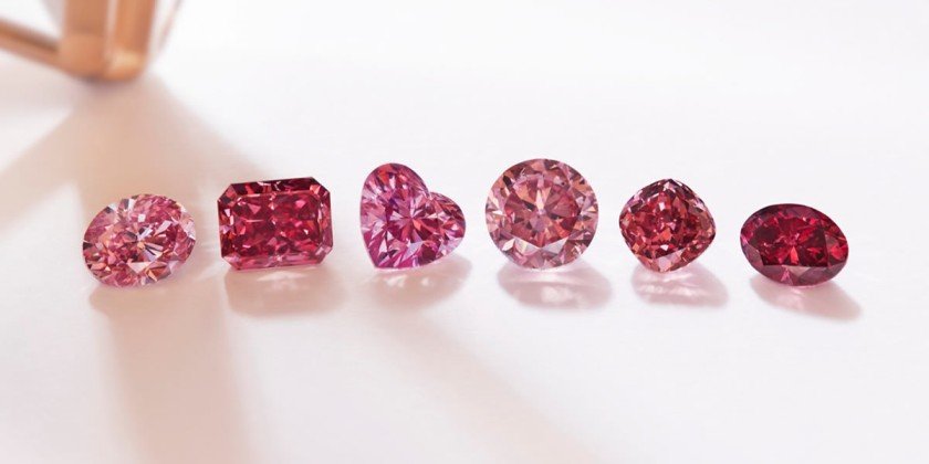
The shift can be traced to a single source in Australia that produced pink stones with a consistency and character the market had never encountered before. This was not about volume. Production was always limited. What mattered was credibility. For the first time, pink appeared in a form that demanded technical attention rather than aesthetic tolerance. It forced the industry to reassess its assumptions.
High jewellery houses were initially cautious. Pink did not fit comfortably into existing design language. Early pieces were often conservative, using familiar settings to test reception. Collectors responded differently than expected. Instead of treating pink as novelty, they asked technical questions. They wanted to understand colour stability, origin, and grading. This curiosity marked a turning point. Pink was no longer a stylistic risk. It became an intellectual one.
Designers began to adapt. They learned that pink required restraint. Heavy metalwork overwhelmed it. Overdesigned settings distracted from it. Successful pieces allowed space. White metals became dominant because they framed colour without interference. The result was a quieter, more deliberate aesthetic that contrasted sharply with earlier high jewellery traditions.
As confidence grew, pink moved from accent to centrepiece. Jewellery houses stopped hiding it among other stones. Entire designs were built around a single hue. This was a radical departure from the multi-stone compositions that had defined high jewellery for decades. Pink taught designers that focus could be more powerful than complexity.
Collectors played a decisive role in reinforcing this change. Those who acquired early pieces noticed something unusual. Pink did not behave like other colours in the market. It did not cycle in and out of favour. It remained desirable across regions and cultures. This consistency gave collectors confidence to commit at higher levels.
Over time, pink developed its own internal hierarchy. Subtle variations mattered. Saturation, undertone, and brightness were debated with the same seriousness once reserved for clarity grades. Education followed demand. Laboratories refined grading systems. Auction houses adjusted cataloguing language. Pink gained structure, and with structure came authority.
Within this evolving landscape, Argyle Pink Diamonds became a reference point that designers and collectors could align around. They demonstrated that pink could be both rare and rigorous. Their existence legitimised pink as a category worthy of long-term consideration rather than seasonal interest. Importantly, this influence extended beyond the stones themselves. It shaped how pink was treated across high jewellery more broadly.
Another significant impact was psychological. Pink challenged traditional ideas of strength in luxury. It proved that power did not need to be dark or heavy. Subtlety became a form of confidence. This shift resonated with a new generation of collectors who valued distinction over dominance. Pink offered a way to signal knowledge rather than excess.
Design processes adjusted accordingly. Many houses began designing from the stone outward rather than from concept inward. Pink dictated proportion, setting, and even wearability. Jewellery became more personal and less declarative. Pieces were designed to be lived with rather than displayed.
Argyle Pink Diamonds remain central to this narrative not because of branding, but because they altered perception. They showed the industry that colour could redefine seriousness. Pink did not change high jewellery by shouting. It changed it by insisting on being taken seriously.
When a colour earns that level of respect, it stops being a trend. It becomes part of the language.